
Samson Tonton: Artist to Watch!
- MMM Staff

- Feb 6, 2023
- 2 min read
Art by diverse creatives has always been uniquely able to capture our experiences. Samson Tonton is one to keep on your radar!
By: Inayah Moore & Nyasia Almestica
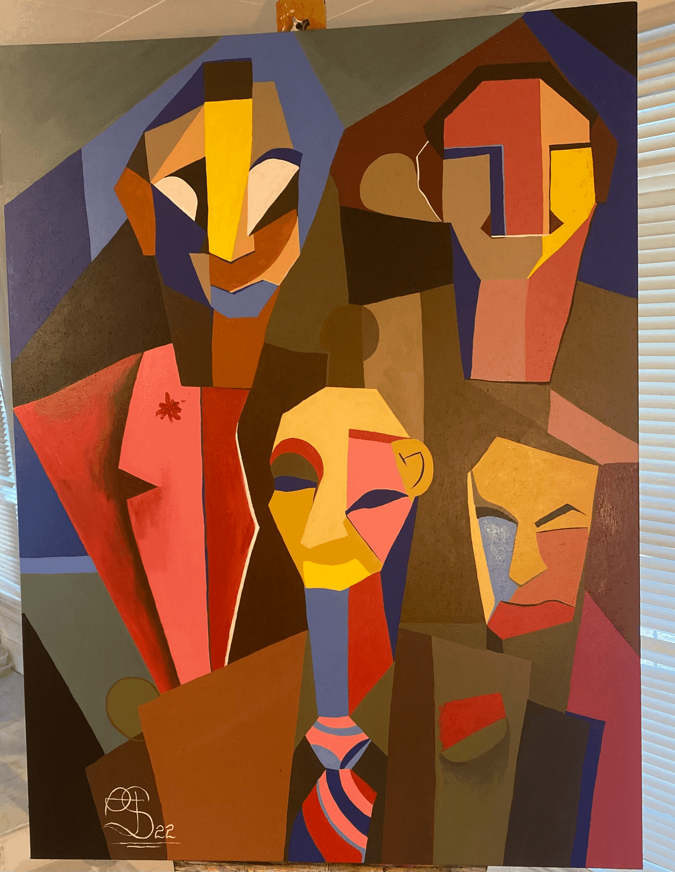


"I just want to paint."
When you meet Haitian-American artist Samson Tonton he'll tell you that immediately. A lifelong artist, his style is cubism– a square form of painting that evokes raw, blunt emotion using sharp edges. Saturated colors and purposeful brush stokes add to the painting's intentionality which, for some of the works, can be very confrontational.

Sometimes his work keeps him up for nights on end, foregoing food until the painting in his head is finally on the canvas.
"For me, I can completely forget to eat," he said laughing.
When it comes to his style, he shirks comparisons to Pablo Picasso, another famous painter who utilized cubism, saying that the style didn't originate with him.
"This is a much, much older style that has African origins and so I do want people to know more about art history and perhaps my paintings can spark an interest," he explained.

And with recent gallery showings and major displays, Tonton is actually in a minority for Black artists.
In 2019, Blavity published an article with findings of a study by Williams College illustrating the lack of diversity in US museums. The study found that most US art museums only show art created by White men or women. Researchers discovered that only 1.2% of art in US museums is produced by Black artists, the lowest of any race. The absence of Black art in museums highlights the underrepresentation of Black artists.
"I want to be in more museums, I want to do more showings," Tonton said. "I'm excited to see how the industry transforms over the coming decade and to play a big part in that is very exciting."


soi cau mb hôm bữa thấy nhiều người nhắc quá nên mình cũng bấm vào coi thử cho biết thôi. Mình không có rảnh ngồi đọc kỹ từng nội dung, chủ yếu lướt vài vòng xem trang họ sắp xếp kiểu gì. Cảm giác đầu tiên là giao diện nhìn khá dễ thở, không bị nhồi chữ dày đặc nên kéo xuống cũng nhẹ nhàng. Mình để ý mấy phần thông tin họ trình bày theo dạng bảng cột khá gọn, nhìn qua là nắm được ý chính chứ không phải căng mắt dò từng dòng. Với lại menu đặt chỗ dễ thấy nên bấm qua lại vài mục vẫn biết mình đang ở đâu, không bị lạc. Nói chung…
Really liked how this post kept things simple and didn’t make me feel like I had to “study” it. The flow was easy enough that I could skim, then jump back to the parts I cared about without losing track. Halfway through I clicked around https://newimage.io/ out of curiosity, and it gave me that same clean, no-drama feel where you can find stuff fast. I’m not into walls of text, so the shorter chunks and clear breaks helped a lot. Also appreciated that it doesn’t try to be overly clever with formatting — just straightforward and readable. On the site itself, the layout feels tidy with obvious headings and spacing that makes scrolling feel smooth.
kuwindow.cc hôm bữa mình lướt thử vì thấy bạn bè nhắc, kiểu vào xem giao diện thôi chứ không có ý định làm gì nhiều. Ấn tượng đầu là trang nhìn khá gọn, thanh mục ở trên cùng để mấy phần chính nên chuyển qua lại nhanh, không phải mò. Mình có đọc ké mục Hướng Dẫn & Giải Đáp, thấy họ giải thích chuyện kết quả dùng RNG theo kiểu dễ hiểu, không viết vòng vo. Chữ không bị dày đặc, chia thành các đoạn ngắn nên đọc lướt cũng nắm được ý. Nói chung cảm giác giống một trang tổng hợp thông tin hỗ trợ, nhất là phần Hướng Dẫn & Giải Đáp trình bày theo dạng câu…
https://tylekeopro.com/ dạo này thấy mọi người nhắc hoài nên mình cũng bấm vô coi thử cho biết, kiểu xem nhanh giao diện chứ không có ngồi đọc kỹ. Vào cái là thấy trang bố cục khá gọn, nhìn không bị “ngợp”, lướt xuống một chút là hiểu đại khái nội dung nằm đâu. Mình thích nhất là cách họ chia nội dung thành từng khối rõ ràng nên mắt bắt thông tin nhanh, không phải căng não tìm. Thanh menu cũng để chỗ dễ thấy nên đổi qua lại mấy mục khá tiện, cảm giác dùng mượt và nhẹ. Nói chung chỉ cần vậy là đủ để mình có ấn tượng tốt ban đầu, vì các khối nội dung và…